Tuesday, 27 September 2016

Initial Ideas for Target Audience

What is Target Audience?
The Target Audience is the demographic that producers and directors aim to entertain and make a film for. The target audience can be identified using a number of things:
  • Stereotypes - Regardless of whether it is right or wrong, the media will often use stereotypes to determine the target audience. For example, romance films are stereotypically aimed at girls and women.
  • BBFC Rating - ratings will determine the age(s) of people watching the film.
  • Surveys - Sometimes surveys will be used to determine the target audience of a film. People will answer questions to help the filmmaker decide whether certain groups will find the film interesting or not.
  • Previous films - bigger production companies may be able to use previous films to provide a basis for the target audience. For example, if Disney are making an animated princess movie, they may be able to see that Cinderella (1950) was popular with young children. However, nowadays Disney perhaps has to worry less about audiences because they are able to produce 'tentpole' films.
Initial Ideas for the Target Audience
My instincts tell me that I should make the film a 12/12A. This is because I think that pre teens/teenagers will be able to appreciate the fantasy elements more so than adults. I think this is because teenagers are frequently exposed to a digital world where they lose sense of reality. Therefore they may be able to comprehend the fantastical elements more easily. Also, at 12 and up, I think children would be old enough to cope with darker plots. 

Monday, 26 September 2016

Planning - Initial Ideas

My powerpoint presentation on initial ideas can be viewed by clicking here
Information on Idea One can be viewed by clicking here
Information on Idea Two can be viewed by clicking here.
Information on Idea Three can be viewed by clicking here.

PLEASE NOTE THAT ALL LINKS OPEN IN A NEW WINDOW.

What do I need to do next?
I need to research into and establish my target audience and select an idea.

Introducing Main Task

For my main task, I am going to produce one main product and two ancillary products.
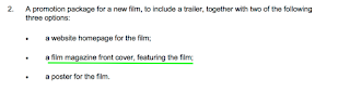
The images included - captioned rejected product 1 & 2, and ancillary product one (underlined) and ancillary product two (underlined) are from the OCR Specification.
Chosen idea:
From the specification, I am going to produce a promotion package for the film.
Rationale:
The reason why I have chosen to do a trailer is because it will allow me to demonstrate capabilities in editing. It may also require less filming, which I find easier on a practical level because of my disability. Therefore I am going to direct someone with the camera, as approved by OCR. I also think trailers are more interesting because they enable you to follow a kind of non linear structure and compile the best moments of the film in order to show the film in the most positive light. I find it fascinating how, even if the clips do not follow in the film, the concept of the film can still be conveyed to the audience.


Rejected product 1
The reason why I have rejected the music video product is because I do not feel my ideas would be imaginative enough to avoid clichés. I would probably find it difficult to convince my friends to act in a music video and am conscious of issues surrounding copyright.


Rejected product 2
The reason why I rejected the short film was because I would have had to devote more time to film. If I shot the footage in a linear order, it would have been difficult to experiment with editing. Throughout my A2 Year, I want to show progression in skill and experiment with new mediums. I do not feel as if the above task would enable me to do that enough.

Ancillary products:


Ancillary product one (underlined)
The reason why I have chosen to do a magazine front cover is because it allows me to develop and improve the skills and knowledge that I acquired from my GCSE Coursework. I would be interested in making it more sophisticated. Making a magazine cover also allows me to better understand software such as In Design. 
Ancillary product two (underlined)
My reasons for choosing to create a poster are:
  • It will give me the opportunity to develop my proficiency in In Design and potentially Photoshop
  • There are a lot of existing, effective posters from which I can see the conventions and gather inspiration for my own film. I can also express my concept using a more succinct and precise platforms.  
Examples of ancillary products:

Poster promoting Passengers (2016), at ComicCon


Magazine cover promoting Divergent (2014)
I have tried to find examples which relate to my chosen genre in order to get better suited ideas and inspiration.
Both the poster and magazine cover I have found use gender neutral colours such as yellow and white which could be indicative of the target audience; fantasy doesn't usually appeal to one gender more than the other. On the other hand, the grey and blue colours are suggestive of masculinity. I will consider stereotypes and whether it would appropriate to break them when looking at my target audience.

Thursday, 22 September 2016

Research - Dear John (2010) trailer analysis (Romance) FOCUS ON CAMERA AND MISE EN SCENE

For this analysis, I am focussing on camera and mise en scene. This is because romance films often use idyllic locations and lots of different shot types to represent the relationship between two people. As most of my ideas revolve around two characters, this will be interesting to examine.
Institutional Information
Dear John is a 2010 romance film starring Channing Tatum and Amanda Seyfried. It was based on the novel by Nicholas Sparks and was directed by Lasse Hallström. The production companies involved were Relativity Media and Temple Hill Productions. It was distributed by Screen Gems and Paramount Pictures. The screenplay was done by Jamie Linden. Filming locations included South Carolina.The budget was $25 million, and it made $115 million dollars, making a profit of $90 million dollars.

Synopsis
The film follows John, a Staff Sergeant in the United States Army Special Forces. In 2001, whilst on leave, he meets Savannah Curtis. Romance soon blossoms, but in light of the 9/11 attacks, John is forced to go in the middle of the conflict. Savannah suggests that the two start writing letters, so they can keep track of what is happening when they are not together. Dear John questions whether romance can survive distance.

Camera
Long shot
This long shot is effective because we can see Savannah chatting to her friends. However, we can also see John looking over at Savannah, so in a way it is a POV shot. As it is a romance film, if the audience know a short synopsis, it can be inferred that John falls in love with Savannah.


Close up shot
This close up shot allows us to see the emotions of Savannah. It also puts the audience in the position of the character.


(Long) two shot
This long two shot is conventional of romance films, as it shows the two subjects together, having fun and bonding. The meeting of the two characters is very stereotypical. John embodies the stereotypical protagonist/hero. Savannah very quickly becomes charmed by this. They also are gazing each other, John makes Savannah laugh by hitting the pillar with his surfboard. This suggests that John was distracted by Savannah and substantiates the idea that he loves her.


Extreme Close Up
The above extreme close up is interesting. The moon is a symbol of beauty, deities and fertility. As Savannah (Amanda Seyfried) is a woman and plays an instrumental role in this movie, it is significant. It also makes the audience realise how comparable we as humans are to the planets and may evoke certain audience pleasures like reassurance.


Two shot
(Mid)
This mid shot is effective because it conveys an intimate moment between the couple. The audience may be able to empathize with this, or feel privileged to be "let in" to their love story. The mid shot gives us a more focussed shot whilst allowing us to see the emotion on the characters' faces. This puts the audience in the position of the characters. The proxemics of the actors suggest that the characters are very close. This makes the separation of the characters even more heart wrenching for the audience.

Mise en Scene
The locations used in this movie can be greatly contrasted. However, the principal setting is a coastal city (Charleston, South Carolina) and so many scenes are on or near the beach. This is a stereotypical location for romance films because it is usually very relaxing and serene. There is also an idea that watching the sunset, hearing the waves and seeing the stars is the way to feel at peace. An example of this miss en scene is shown in the long shot below:
At the beach


Medium close up
The above medium close up helps to demonstrate the location. Savannah is reading John's letter by the light of the projector which conveys that she is a student. Therefore the divide between the lovers is made clearer; they are taking different paths.


Close up
This close up of John's uniform shows that he is preparing to go back to the Army. This may make the audience sad because they know he is leaving Savannah. It also adds to the characterization of John as the stereotypical masculine hero. On the contrary, we know from other moments in the  trailer that he does have a softer side, such as when he is indecisive and is crying. The audience may sympathize with him. This is effective because they can be reassured that stereotypes are being broken. The stereotypical romance film audience is a female demographic. The softer side may make them feel glad that Savannah has found someone who really cares about her.

The lighting used is natural to suggest that this is the type of thing that could happen to anyone, and to create verisimilitude. This is easier to do with romance movies because they are not often set in futuristic worlds and don't encounter unrealistic situations. The proxemics of the actors is significant, they are in love so inevitably very close. This makes the separation more prominent, as shown in the mid two shot. 

Overall Contribution/Effect
The overall  contribution of the mise en scene and camera is obviously large, but its effect is positive.

Sound Analysis: Nanny McPhee Returns (2010) trailer

A sound bridge is used. This occurs from 0:06-0:08. This non diegetic music continues until 0:19. a voice over is used throughout  to give the audience a basic understanding of the film and to pre-empt the camera shots. This directly engages the viewer and makes them feel more involved. The cousins are almost presented as a disequilibrium as there is no non diegetic sound at 0:19. The calm atmosphere is disrupted with the appearance of the children. The fast paced music parallels the action on the screen.When the children start causing trouble, there is more fast paced, less fairytale like music from 0:22-0:34. This is probably to represent the havoc being caused.
However, the non diegetic sound loses prominence at 0:27 when the diegetic sound becomes the focus. At 0:32, the sound is particularly effective because it becomes loud and has an echo effect. At 0:34, the sound effect of knocking is the most significant sound. This is then overshadowed by the use of loud and high pitched music from 0:35-0:37 in order to build tension. The comparative silence at 0:38 means that the declarative has more impact. The vast majority of the trailer uses non diegetic sound, voice overs and dialogue together. This makes the trailer seem more interesting and engages the audience, whilst also representing the mischievous nature of the children.

The absence of non diegetic sound (soundtracks and voice overs) at moments such as 1:14-1:15 makes what the characters say have more impact, and takes the audience back to a central focus. Breaks in the sound stop it from becoming too overwhelming for the senses. The sound effect of fairy dust is frequently used. The changes in soundtrack also help the audience to identify the mood of the shot(s). For example, from 1:49 onwards the mood is a lot happier and the soundtrack reflects this.

Overall effect/contribution
The overall contribution of sound is large because it helps reflect the mood of the movie, and brings to life the camera shots and editing.

The film is promoted as Nanny McPhee and the Big Bang in the UK.

Wednesday, 21 September 2016

Research: - Amy (2015) trailer analysis (Documentary) FOCUS ON EDITING

AMY (2015) trailer analysis (Documentary) FOCUS ON EDITING
Institutional Information
Amy (subtitled for promotion as The Girl Behind the Name) is a 2015 documentary movie depicting the life and death of British Singer-Songwriter, Amy Winehouse. It is directed by Asif Kapadia and produced by James Gay-Rees, George Pank and Paul Bell. It is distributed by Altitude Film Distribution and A24. The production companies involved are Film4, Krishwerkz Entertainment, On the Corner films, Playmaker Films and Universal Music. It is edited by Chris King and the cinematography was done by Matt Curtis. Amy was released in the UK on 3 July 2015. The budget was $3.4 million and it made $22 million at the box office. This resulted in it becoming the highest grossing British documentary of all time. It has won a plethora of awards and accolades, including a Grammy for Best Music Film and an Academy Award for Best Documentary Feature.

Synopsis
Amy uses archived footage, home videos and interviews with those who knew her best to provide the audience with an emotional look at the singer's life, death and legacy.

As this is a documentary, I have decided to focus solely on editing as the trailer will intelligently piece footage together. Being a non specific analysis, I think this will allow me to look at how editing contributes to trailers as a whole in anticipation of my own product.


Amy (2015) Official Trailer

Editing - Titles
Titles
In this trailer, titles are used to mark the different stages of the trailer. For example, some footage  has already been shown but this tells the audience that this is a new film from a recognised team, whilst introducing it. The large text could reflect the bold persona that Amy possessed when in the public eye.

Titles
This title indicates to the audience that the film is going to be emotional. "Journey" suggests that viewers are taken on a path through her life, death and probably her legacy. It also implies that the film is impactful. The red could represent the adoration that people felt of Amy, whilst connotating danger and passion. From this, it is suggested that the film shows her to be a very complex character. However, the white could represent how viewers are given an insightful look at her life. This is because white connoted innocence. These connotations are substantiated by the titles below.


Transitions
There are fade to blacks at 1:05-6, 1:19, 1:22-3, excluding fades for titles.  This could be to build tension and help the general progression of the trailer. It also adds fluidity. At times, like at 1:02, the camera flashes act as a transition. 

Structure
The structure is interesting  footage is not sequential, it is taken from different parts of the film. However, the audience is able to connect the footage together to formulate an idea of the plot. There is also a clear beginning, middle and end. For example, at the start those who knew Amy introduce her. Then, as the trailer progresses, there is a clear change in mood. This is especially evident from 1:30 onwards. The music becomes more sombre and hence the footage slows down. The trailer uses parallel editing as the sound fits with the footage on screen. The footage from 1:30 onwards is a stark contrast to prior to this. For instance, there are quick cuts to represent Amy's whirlwind fame. There is also some footage with stop motion effect from 1:13-14.

Overall effect/contribution

The overall contribution of the editing is great, and the effect is positive. It helps to portray different sides of Amy and helps the audience to create a mini story in their heads. This is done through having distinct sections to the trailer, conveyed by changes in atmosphere, speed of footage and music.

Focussing on Editing

Editing 
Film editing is the art, technique and practice of assembling shots into a coherent sequence. In the context of trailers, this often involves picking the best bits of a film. I have decided to focus to write an analysis in order to understand the contribution editing makes to the whole trailer.

Types of editing
Structure

  • Continuity editing - also called invisible editing. In this, the editing is fluid and there are no transitions.
  • Non linear - parts of footage taken from different points of the film. The footage is not consecutive.
  • Linear - the story is a long consecutive sequence. Events are edited in the order that they happened
Transitions (a few examples)
  • Fade to black
  • Dissolve
  • Fade to white
  • Cross cutting
  • Blur
  • Cross dissolve
Cuts (a few examples)
  • Jump cuts
  • Cross cutting (also a transition)