The images included - captioned rejected product 1 & 2, and ancillary product one (underlined) and ancillary product two (underlined) are from the OCR Specification.
Chosen idea:
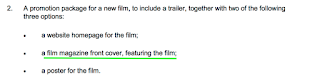
From the specification, I am going to produce a promotion package for the film.
Rationale:
The reason why I have chosen to do a trailer is because it will allow me to demonstrate capabilities in editing. It may also require less filming, which I find easier on a practical level because of my disability. Therefore I am going to direct someone with the camera, as approved by OCR. I also think trailers are more interesting because they enable you to follow a kind of non linear structure and compile the best moments of the film in order to show the film in the most positive light. I find it fascinating how, even if the clips do not follow in the film, the concept of the film can still be conveyed to the audience.
 |
| Rejected product 1 |
 |
| Rejected product 2 |
Ancillary products:
I have tried to find examples which relate to my chosen genre in order to get better suited ideas and inspiration.
Ancillary product one (underlined)
The reason why I have chosen to do a magazine front cover is because it allows me to develop and improve the skills and knowledge that I acquired from my GCSE Coursework. I would be interested in making it more sophisticated. Making a magazine cover also allows me to better understand software such as In Design.
My reasons for choosing to create a poster are:
 |
| Ancillary product two (underlined) |
- It will give me the opportunity to develop my proficiency in In Design and potentially Photoshop
- There are a lot of existing, effective posters from which I can see the conventions and gather inspiration for my own film. I can also express my concept using a more succinct and precise platforms.
Examples of ancillary products:
 |
| Poster promoting Passengers (2016), at ComicCon |
 |
| Magazine cover promoting Divergent (2014) |
Both the poster and magazine cover I have found use gender neutral colours such as yellow and white which could be indicative of the target audience; fantasy doesn't usually appeal to one gender more than the other. On the other hand, the grey and blue colours are suggestive of masculinity. I will consider stereotypes and whether it would appropriate to break them when looking at my target audience.
No comments:
Post a Comment